You’re walking down Market Street in the search for those new shoes. You want something fashionable, trendy, professional and the guarantee they’re not going to fall apart. You see a shop with the name ‘Magic Shoes’ in Comic Sans above the door, with cobwebs strewn across the cracked window and shelves stacked with dusty brown boxes. Realising you’re not a wizard on Diagon Alley, River Island’s glossy, quirky window display reveals itself to be the best option.

This same principle applies to websites. For most consumers, your site is probably the first point of contact with your brand, products and services, and just like walking down Market Street, first impressions really do count. Websites and their landing pages are a fantastic opportunity to tell your brand story, and we all love stories. If your website design doesn’t inspire your audience, they’re going to leave, quickly. But those fancy graphics don’t mean all is fine and dandy just yet.
Going back to my Diagon Alley shoe shop analogy, if you walked in and specifically wanted shoes for Quidditch, you would expect there to be a clearly marked area for Quidditch shoes and that you do not have to go through the Triwizard Tournament to get there. Make your site easy to navigate with clearly marked menus and do your best to ensure the viewer gets to the content they want with as few clicks as possible. I believe quality content is the way forward, so entice your viewers with content they just can’t ignore. Show you know your stuff with industry news, but remember it’s the small details that count. If content is boring, plagued with spelling and grammar errors, it isn’t going to paint a great picture of your brand. I often come across agency websites that still use the old Twitter logo, unaware that one of the world’s biggest social networks actually underwent a rebrand quite some time ago. It makes me question whether they pay attention to small details like this for their clients.

On the subject of social media, consumers are much more expectant of further brand engagement, so don’t obscure the fact that you talk to your customers on Twitter and Facebook by hiding the buttons at the bottom. Stick in a little Twitter feed or show how many of their Facebook friends have already liked your page.
Recent research suggests that mobile adoption is at an all time high, growing at rates faster than the adoption of PCs, the internet and social media. That leaves no doubt that your website should be adapted so it still looks pretty and usable on mobile devices like tablets and smartphones.
Now you’ve impressed your viewer with some marvellous, magical content, it’s important to let your potential customer know what to do next. Would they be interested in signing up to your newsletter? You could refer them to your infographics, or they might just want to cut straight to the chase and contact you (score!). Make these calls-to-action standout and be creative.
To be one of the greats, you have to learn from the greatness already out there, just like Harry did with Dumbledore. Have a browse round your favourite sites and jot down what you like about them. Here are a few that I particularly like:

Design Taxi
Design Taxi oozes simplicity yet I end up exploring its content for hours. Of course not everyone’s interested in weird creative things, but for those who are, this site does not disappoint. The never-ending scrolling means that just when you thought you’ve read all the articles that could possibly interest you, you get another stream of catchy headlines and pictures of cool things. With it being so easy to share (much to my Twitter followers’ dismay) Design Taxi has garnered over 300,000 followers, and some good discussion with Facebook comments on nearly every article. Now that’s how you do it.

Pull & Bear
Another very simple yet effective design from fashion retailer Pull & Bear. I love big images, which are even more important for fashion retailers, and this site has plenty of them, and they make me want to buy clothes. The filter lets you get down to specifics, their lookbooks are nice and they even have a section dedicated to everything social, ensuring their audience engages with more than just the product.

Parallax pages: Life of Pi Movie
Parallax pages are popping out left right and center. They definitely tick the ‘visually engaging’ box and are a great way to tell a story. They're even better if you have an Apple Magic Mouse. But anyway, the guys behind the movie Life of Pi made a parallax scrolling page to tell their story about how they made the film. Done right, you can get a very impressive visual page and you’ll look ahead of the times to your audience.
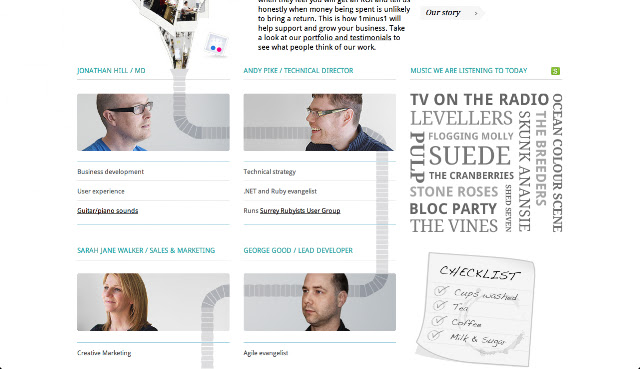
Talking of your story, this ‘About Us’ page from 1minus1 is a great example of how you can introduce your team to make things that little more personal.
I’ve also come across some examples of terrible web design, most of which so bad I have forgotten all about them, but here are a couple I came across today:

Too little or too much
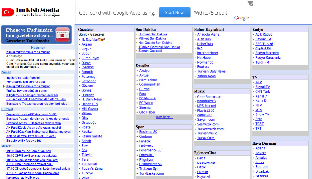
The uninspiring TurkishMedia.net is an awful design that offers a host of links to some other awful websites and links are often broken. LingsCars on the other hand almost gave me a headache. It’s apparently become his ‘thing’ to have such an atrocious design that it’s actually quite clever and provides us with some great lessons: visitors don’t want random music to start playing that they didn’t ask for, or can be put off by too many graphics, fonts, colours… visit yourself and I needn’t say more.
It’s clear websites have come a long way. To get your shop window noticed, it should reflect what’s in the shop. It should be creative, eye-catching and target who you want to come in. Things get a little different online; you don’t get Harry and Hermoine walking past – you have to make them aware you exist, which is where your online marketing strategy comes into play. Although there’s now lots to think about, it’s a brilliant opportunity to just have some fun with creativity and the many types of content to work some magic on your brand’s online home.
No comments:
Post a Comment